This article is for paid members only
To continue reading this article, upgrade your account to get full access.
Subscribe NowAlready have an account? Sign In

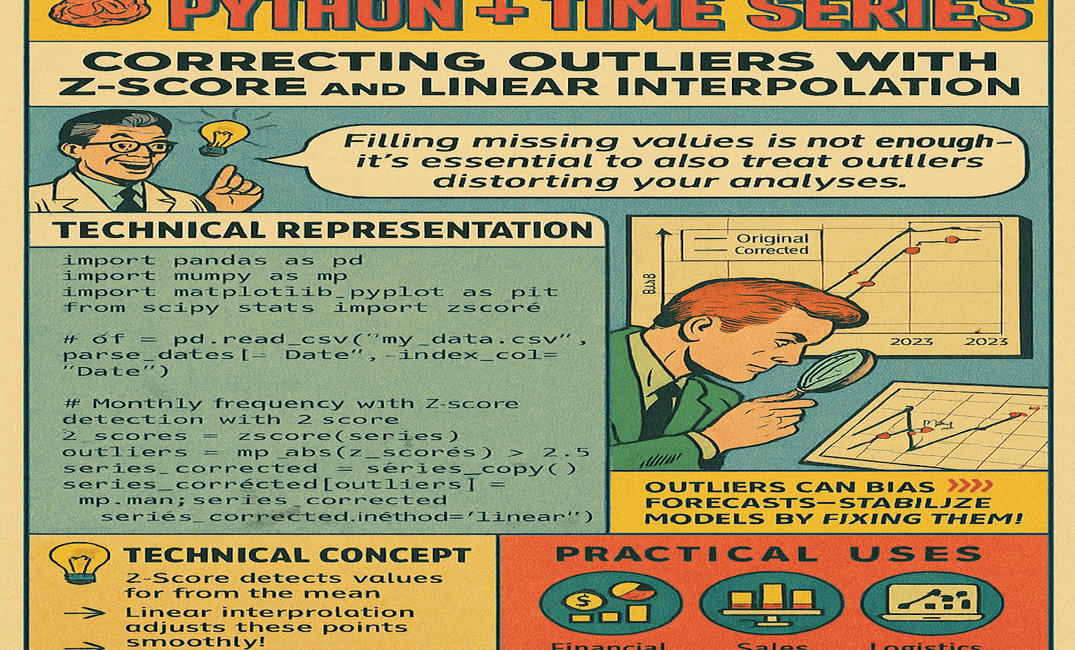
PYTHON + TIME SERIES – Correcting Outliers with Z-Score and Linear Interpolation
To continue reading this article, upgrade your account to get full access.
Subscribe NowAlready have an account? Sign In